A Whirlwind Glance Back at ArtWeek Miami 2016.

A R T W E E K    M I A M I    2016

img_1534cs

Life imitates art? – A visitor to the SCOPE art fair, beside the piece “Luxury Dinner” by Philippe Shangti, at the Art Angels booth, in Miami Beach, on Sunday, 12/4/16.

TAKING A WHILRWIND GLANCE BACK AT ARTWEEK MIAMI 2016.

(I originally wrote this article back in 2016 and it got stuck in my Drafts Folder when other life events hit my plate. Jut thought I’d go ahead and post what I’d written so it could finally see the light of day.)

MIAMI ~ Seeing everything on view during ArtWeek Miami is a seriously impossible task. With more than 20 official fairs, countless galleries, random gatherings, and pop-up street events, it’s just too much to take in, even if you can get early VIP previews and media access.

In this article, we’ll take a whirlwind tour, stopping to highlight just a fraction of the seemingly infinite events that were vying for viewers on the first weekend in December 2016. Before our more in-depth reviews, (to follow later), we’ll take a quick look at the following events. ArtMiami, Superfine, Wynwood Walls, Peter Tunney Experience, Goldman Global Gallery, Wynwood District Street Art, Aqua Art Fair, INK Miami Art Fair, and Secret Walls Miami. I also covered the The Raw Project at Hartner Elementary School, ArtBasel Miami Beach, and SCOPE Art Fair. But who knows If I’ll ever get to posting those reports.

~ ArtMiami

First up is the Art Miami fair. Located at 3101 NE 1st Ave. in Midtown.

As the longest-running contemporary art fair in the city, this fair showcases modern and contemporary art from 125 international galleries. It strives to provide “an intimate look at some of the most important work at the forefront of the international contemporary art movement.” Housed in a huge tent on a lot between the neighborhoods of Wynwood and Beverly Terrace, it made a good starting point, or base station for exploring most of the other events, especially since it offered a free shuttle service to its sister events CONTEXT Art Fair, just a block away, and AQUA Art Miami on Collins Avenue in Miami Beach.

Their post-fair press release stated they had 78,000 attendees combined for Art Miami and CONTEXT, and hosted 10,500 guests at their VIP Preview.

Art Miami 2016 had all the powerhouse names you’d expect in a Modern and contemporary show, like this Damien Hirst “5-Hydroxyuridine” (above) from Galerie Von Vertes. This Zurich gallery had an impressive booth, with several works by other heavy-hitters like Alexander Calder, Josef Albers, and Robert Rauschenberg.

There were Warhols and Hairings and Banksys and their followers around every corner, but there were definitely some lesser-known gems to be discovered.

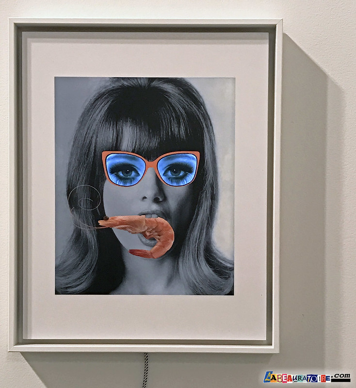
Daniel Cherbuin, The Shrimp (groß), 2015, mixed media, edition of 8, video loop: 55 min. 11 sec., 73 x 63 x 3 cm

I was lucky enough to meet the artist Daniel Cherbuin at the booth of Galerie von Braunbehrens. His mixed media “video paintings” were definitely drawing crowds. Their whimsical nature combined with retro iconography, feel like the next step toward the inevitable future of art. Check back later to read my interview with this intriguing artist from Zurich.

Gordon Parks – At Segregated Drinking Fountain, Mobile, Alabama, 1956
2016 – Archival pigment print, Edition of 7 – 34 x 34 inches; 40 3/4 x 39 3/4 inches framed

The New Orleans based Arthur Roger Gallery had a number of unexpected finds. Some incredibly relevant color photographs by groundbreaking photojournalist Gordon Parks, and other wonderful pieces by James Drake, Troy Dugas, and George Dureau.

Detail from “Portrait Group” by Maurizio Anzeri. Embroidery on found photographs.

Another exciting find was the colorful, stitched work by Italian-born London artist Maurizio Anzeri at Haines Gallery out of San Francisco. Using thread and yarn seems to be one of the current fads in contemporary art, but Anzeri definitely puts the medium to an effective use and his embroidery on vintage found photographs was a big standout at this fair.

Another big crowd magnet was the melty work of “3 (three),” a trio of artists from Fukushima, Japan  (above) at the booth of the Miami gallery Now Contemporary Art. The anime doll mashup figures and panels pulled viewers in and beckoned them to look closer at the colorful conglomeration of sexy schoolgirl figures. In some cases the figures were bisected, a la Damien Hirst, and allowed viewers to peek inside at the fleshy innards of the pieces.

An overall impressive show, the Art Miami fair is a good median point (both geographically and aesthetically) on the scale between the ultra-high ticket Art Basel Miami Beach, and the more edgy and emerging events like SCOPE and Superfine.

In a recent release, Art Miami claim they’ve signed a multi-year agreement to hold the event at the former Miami Herald site (One Herald Plaza at NE 14th Street at Biscayne Bay) in downtown Miami starting in 2017.

~ SUPERFINE: The Fairest Fair

The Superfine Art Fair had a much more laid back vibe. Located just one block south of Art Miami at 56 NE 29th St. Superfine was also open later (11pm), so offered an inviting spot to wind down after the larger, more buttoned-down fairs.  There was more of a festival feeling to this show, with dance music playing and drinks available. Many of the artists themselves accompanied their work and were pleased to interact with attendees.

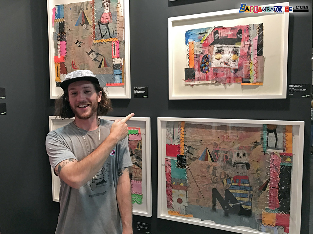
Argentine artist Ramiro Davaro-Comas (above) was just one of the great artists presented by Organized Chaos Curation and one of the many artists attending the fair and available to discuss their work.  His unique, stitched and collaged drawings have a certain naive charm at first, but they get more complicated and refined the longer you investigate their intricate structure. Check back later for my interview with Ramiro.

deStijl is still alive and kicking! One of my favorite art styles, the geometric lines and shapes emblematic of the Dutch deStijl group, pioneered by Mondrian and Van Doesburg, has an infinite potential for new possibilities. New Orleans artist Bean Blackett (above) has tuned in to that wavelength and produced some canvasses that are both fresh and classic at once.

An installation at the booth of Airplane Mode collective presented the controversial work of Master Garrett, with “editions” of the piece available to purchase on USB drive. The rolling video detailed his performance piece titled “PATRON,” where devotees offer the artist “tributes” in exchange for being virtually abused by the burly character portrayed in the piece. Zines from the project were also available for purchase for $3 with intro essay by Emma Sulkowicz.

The vibrant photography of James Miille occupied one of the main central walls at Superfine and it was not surprising to learn that he’s part of the curatorial team and provided most of the imagery for the fair itself. His work walks the tightrope between the real and the surreal. The images often invoke a questioning feeling in the viewer, and that question is “why?” – Why am I seeing what I’m seeing? That visceral interaction is part of its success as a piece of art, and separates it from being just a pretty picture.

The collages of Theodora Richter were another delightful find and another booth where the artist was on the scene to discuss their work. Richter is investigating that eternal relationship between imagery, shape, and structure. Collage is a bit like chess, simple to learn and nearly impossible to master. But with these pieces Richter has proven she’s no novice and makes a strong statement to be added to the lexicon of the medium. Definitely one to keep an eye on. My interview with her will also be coming later.

The Superfine art fair was a blast this year and will hopefully continue to keep its relaxed feel for future fairs. It seems to know what size britches to buy, so it won’t get too big for them.

~ Wynwood Walls.

Kenny Scharf mural near the entrance at Wynwood Walls 2016.

Now in its seventh year, Wynwood Walls has become a kind of defacto geographic center for street art, murals, graffiti and other urban art during ArtWeek in Miami. Each year they invite some of the most popular muralists from around the world to make their mark on the walls of their open-air garden/gallery. While sanctioned “street art” is always somewhat more sterile than work that’s done without permission, the talent and success of their previous roster can’t be denied, and this year’s familiar lineup is no different.

Ron English mural at Wynwood Walls 2016.

PixelPancho mural at Wynwood Walls 2016.

In addition to murals by Kenny Scharf, Ron English and PixelPancho, (all pictured above,) this year’s Wynwood Walls were painted by Aiko, Alexis Diaz, avaf, Case, Crash, Cryptik/DALeast, Daze, eL Seed, Ernest Zacharevic, Fafi, Faile/Bast, Faith47, Futura, Gaia, HowNosm, Hueman, Inti, Kenny Scharf, Lady Pink, Logan Hicks, Maya Hayuk, Miss Van, Neuzz, OS Gemeos, P.H.A.S.E. 2, Peter Tunney, Picho & Avo, Retna, Ron English, Santiago Rubino, Shepard Fairey, Swoon, The London Police, Tristan Eaton, and Vhils.

~ Peter Tunny Experience

Peter Tunney in his Wynwood gallery during ArtWeek 2016.

Nestled right in the center of the Wynwood Walls complex, is the Miami studio and gallery of New York artist Peter Tunny. Stepping into the space offers a nice respite from the Florida heat (yes, even in December), but your eyes certainly don’t get a rest here. There’s an instant onslaught of imagery and Tunny’s artwork is not easily taken in at a glance. It has imagery upon imagery within imagery.

ArtWeek 2016 visitors to Peter Tunney’s gallery in Wynwood, Miami.

Like the proverbial a riddle, wrapped in a mystery, inside an enigma, Tunney’s pieces can be seen on many levels. Most of them have one strong, simple slogan, such as “Change the way you see everything”, or “Crazy Good,” but upon closer inspection, you could spend hours investigating his collage and graphic techniques and still not take in every little detail. His blatant appropriation of contemporary and vintage advertising, not to mention the work of other artists such as Andy Warhol, may put some off, but his skill in combining text and images for impactful results is without question.

~ Originals at Goldman Global Arts Gallery

HUSH & other artists on view at Goldman Global Arts Gallery during ArtWeek Miami 2016.

Goldman Global Arts is the curatorial project of Goldman Properties, which owns the Wynwood Walls property. The Goldman Global Arts Gallery sits in the farthest back section of the Wynwood Walls property, where they hosted the exhibition “Originals,” featuring additional work by many of the artists who who painted this year’s murals. Curated by Jessica Goldman Srebnick and Peter Tunney, visitors got to see new canvasses by artists  1010, Alexis Diaz, Beau Stanton, BIO, Case, Crash, Dasic Fernandez, Daze, Faith XLVII, Fin-Dac, Hueman, Hush, Ken Hiratsuka, Jordan Betten, Logan Hicks, Matthew Ryan Herget, Maya Hayuk, Okuda, Pichi & Avo, PixelPancho, Risk, Ron English, Santiago Rubino, Shepard Fairey, Tatiana Suarez, The London Police, Tristan Eaton, and VHILS.

The gun paintings “Fear Me 1 & 2” by Tristan Eaton (seen in background above) were particularly strong. The monochrome palate is a nice departure from his normally color-rich style. Other standouts were pieces by Hush (2nd above) and PixelPancho, who’s panels in custom-made frames felt a bit like vintage, family heirloom daguerreotypes. And I don’t think anyone stepped up to Beau Stanton‘s eight-foot tall canvas, “Antediluvian Aftermath,” without saying “wow!.” I must have heard it half a dozen times while standing there myself.

Having a “wall-side” gallery with available work by each year’s mural all-stars seems like a no-brainer, and for those of us who normally only get to see Instagram versions of work by the artists we follow, viewing newer work, up close and in person is always a pleasure.

~ Wynwood District Street Art


For about eight blocks in every direction from the Wynwood Walls location, graffiti and street art cover nearly every inch of every wall that isn’t guarded by heavy security. It’s a great place to wander around and discover unsanctioned work by local and international writers and artists alike.

There’s “not even a square to spare” so, in many cases, older pieces are buffed over to make room for new work. Graffiti writers, crews and mural painters from all over the world descend upon the area like locusts and work throughout the week to re-cover every surface they can access. Tags, throwies, masterpieces, and full-blown murals are everywhere you look.


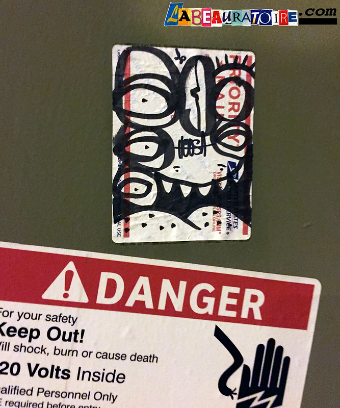
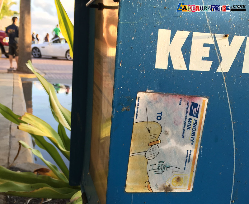
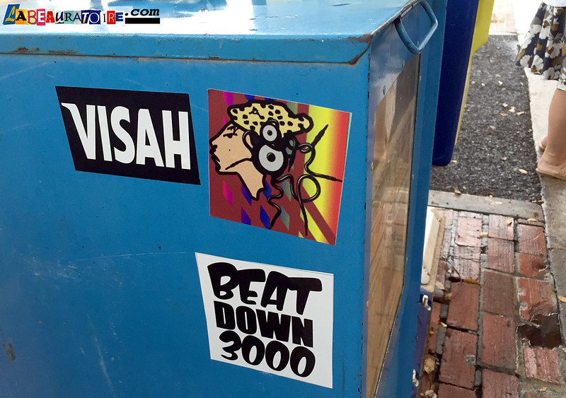
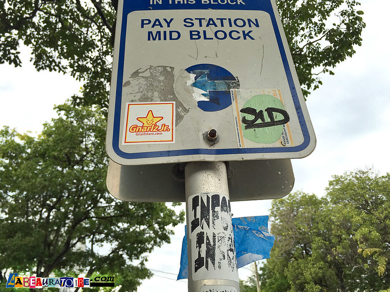
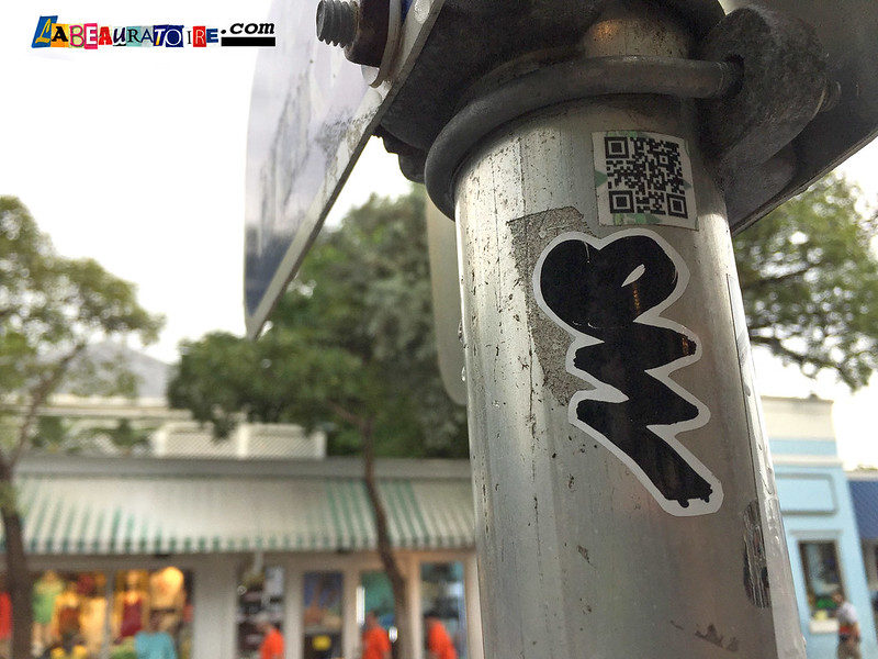
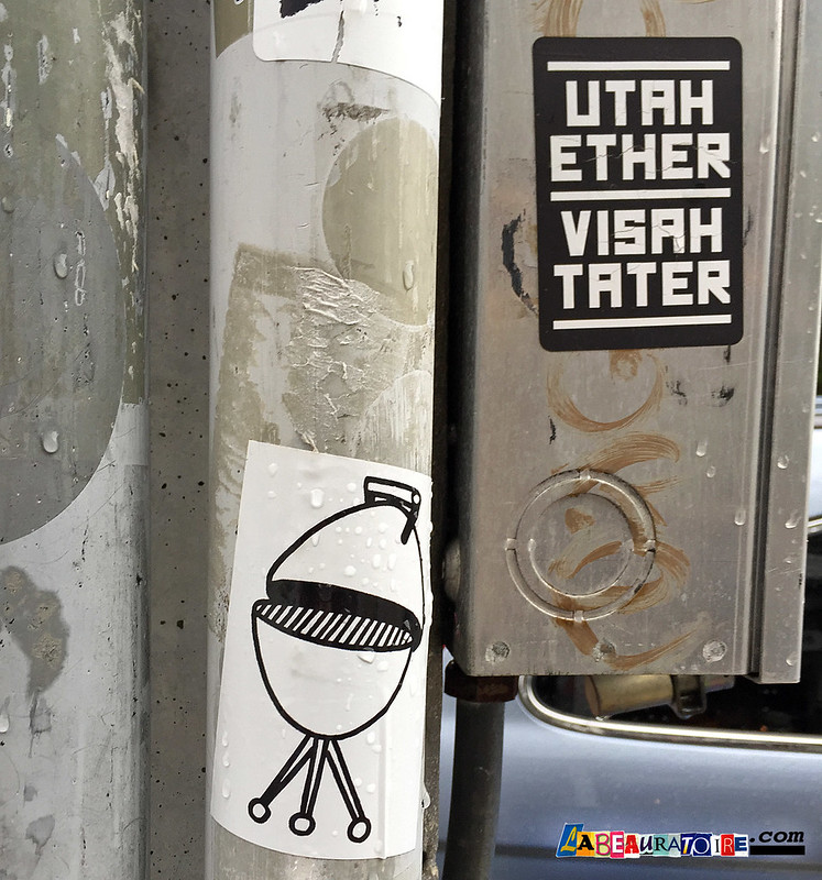
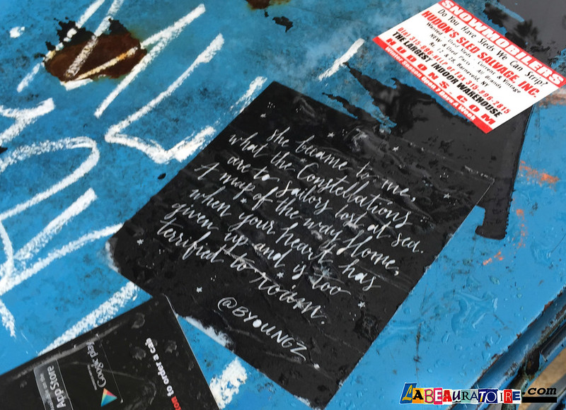
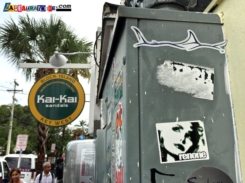
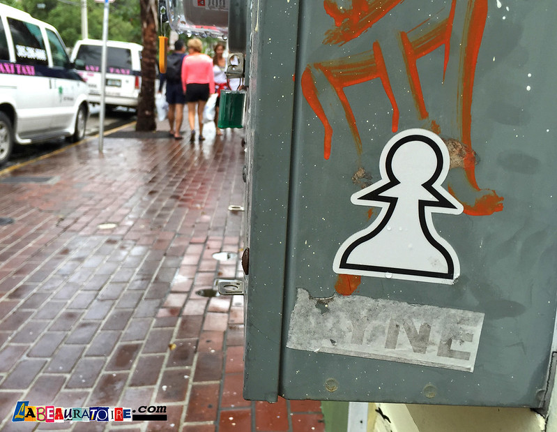
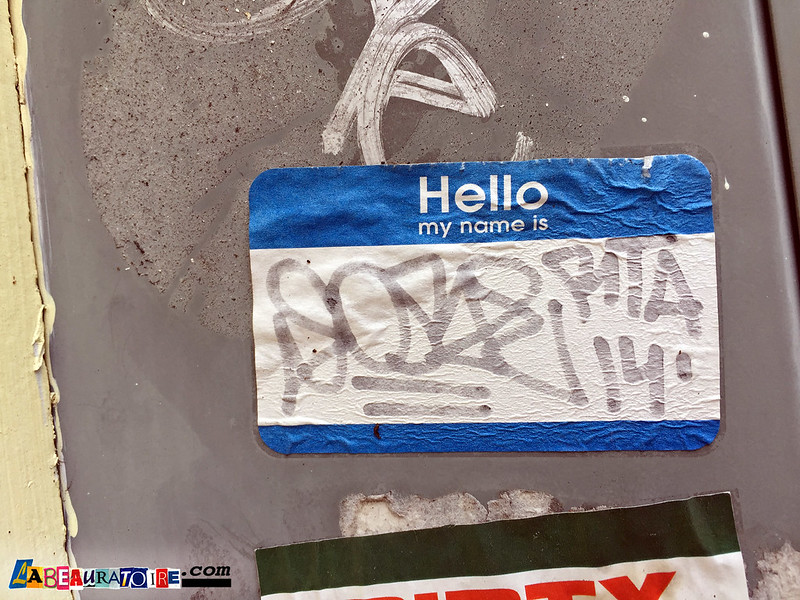
Paint isn’t the only medium used in this yearly attack. Street stickers are a quick and easy way to get your name out there with just a peel and a slap, and they are everywhere!  Many are hand drawn on pilfered labels like those from the USPS (Label 228), while others are made by screen-printing or alternative methods of mass production. Stickers are also a good way for artists to make small, quick pieces that are always ready to go up, or get sold to a fan or traded to a fellow artist, and are sometimes collaborated on by several artists or representing a particular crew.


Wheatpasted posters are another popular medium. I saw some nice work by SacSix, Unpolite Art Machine, Bournrich, Barcelona’s Konair, and Denver’s brilliant Frank Kwiatkowski (seen above.)


Other types of installations are all around if you know how to look for them. Minneapolis yarn artist Hot Tea (above) was hitting the fences around Wynwood with his signature three-dimensional wordplay. Cash for Your Warhol, had placed his signs in some strategic locations, and those faux traffic signs (possibly by Olivia Steele?) with slogans like “Control Yourself” (below) were also being ignored by the masses of people who passed by them.

So needless to say, what’s now (apparently) being called the Wynwood Art District is kind of like ten square blocks of nonstop streetart treasure hunt, and there are jewels to be discovered around every corner.

~ Aqua Art Fair

The Aqua Art Miami fair is one several “hotel” fairs. Similar to the INK, NADA, Fridge, Satellite, and other fairs, Aqua virtually takes over a Miami Beach hotel and utilizes the existing layout to feature its exhibitors. At the Aqua Hotel, 1530 Collins Ave., each room facing the courtyard has been mostly emptied of furniture and replaced with artwork.

There were too many impressive rooms at Aqua to mention them all here, but there were certainly some that rose above the crowd.

I may be definitely am biased when it comes to the Tampa-based gallery Cass Contemporary. Since opening in early 2014, they have hosted many of my favorite artists and their exhibition space (above) at Aqua was no different. After their opening of a magnificent Shark Toof show, “Red Everything” back in Tampa, they presented some of his innovative work in Miami as well. Some three-dimensional objects have begun to emerge from Shark Toof’s paintings and the effect is fantastic. Accompanying that was new work by St. Petersburg artist BASK, (“Sweet Savage” center) and some remarkable pieces by Dallas artist, Michael Reeder, (right) who’s work was so popular at several fairs, that most of it sold out during the preview events. Check back for more in my full report on Cass at Aqua.


The Kallenbach Gallery, from Amsterdam, paired with Favela Painting, to make a superb presentation.  In their space, the Dutch duo Haas&Hahn showcased colorful, geometric details and photographs from their massive mural projects in Rio, Philadelphia, and other cities. The gallery also featured works by other impressive international artists including some exquisite collage/mixed media wood panels by  WK Interact.

Working Method Contemporary, is a collective of MFA students at Florida State University, in Tallahassee. Their exhibit presented one of the most unforgettable paintings of the entire weekend. Viewing the piece “Hoarders Paradise” (detail above) by Christina Klein, feels like being caught in a tornado time-warp, one that’s swept through the cubism section of MOMA. Her amazing ability to present an image of such profound structure blended with an equal dose of chaos, leaves the mind properly boggled, and definitely wanting more.

I could have spent the entire weekend just at the Aqua Art fair and still not had enough time to properly appreciate every gallery in attendance. Every time I tried to make my way to the exit, I happened upon another room containing work I HAD to stop and look at. Some of those included: The Derek Gores Gallery from Eau Gallie, FL, Gama Gallery from Istanbul, The Gallery from St. Petersburg, FL, Chicago’s Vertical Gallery, McCaig-Welles & 212 Arts from New York, and J. Fergeson Gallery from Farmville, VA. I hope to write more about my discoveries at these galleries in due time.

~ INK Miami Art Fair

Another “hotel fair,” the INK Miami Art Fair was held at the Dorchester South Beach Hotel at 1850 Collins Ave.  Unlike other fairs, this one focuses solely on contemporary and Modern works on paper.  Sponsored by the International Fine Print Dealers Association, the exhibitors are all association members, but that doesn’t seem to have restricted the diversity of of the works on offer.

A somewhat hidden gem of the University of South Florida in Tampa is their GraphicStudio, which had a room-full of magnificent work (above) on display at INK.

Established back in 1968, their artists list reads like a who’s-who of printmaking from the last fifty years. Robert Rauschenberg was one of the first artists to work in their facility, but many other greats were to follow, including James Rosenquist, Jim Dine, Ed Ruscha, Judy Chiago, and Chuck Close, just to name just a few.

Robert Rauschenberg “Sheephead” – 1974 – Multicolor relief and intaglio print on fabric with collage of wooden ruler sewn on print.

It’s rare that you get to view such little-known works by Modern masters in person, nevermind having the option to actually purchase one. The Rauschenberg”Sheephead” print (above), priced at $15,900, appeared to have been sold by Saturday morning when I got to see it.

Ed Ruscha – “DO AS TOLD OR SUFFER” – 2001

Many newer artists have also discovered the mastery of GraphicStudio. Artists like Vik Muniz, Alex Katz, Trenton Doyle Hancock, and Christian Marclay (below) have started working with them more recently, and some were on exhibit during this show. If you ever find yourself with spare time in Tampa, do check them out.

Christian Marclay – “Fisssss Bang!” – 2015 – photogravure with aquatint etching

The Rabley Contemporary Gallery, from Marlborough, England, had a lovely display of work, including some very intriguing intaglio and woodcut prints by Naomi Frears. (below)

Naomi Frears – “Just Passing Through” – intaglio and woodcut

I then casually wandered in to the rooms of Stoney Road Press from Dublin. What I saw there, tucked in a back alcove, unassumingly framed, with a standard, white, printed placard, was a piece of artwork that instantly became one of my all-time favorites.


The Irish artist Brian O’Doherty, (before he had temporarily changed his name to Patrick Ireland), invited Marcel Duchamp to his New York apartment in 1966, with intentions to make a portrait of the enigmatic master. The results of this endeavor may be the single most appropriate portrait of an artist I’ve ever seen.

Duchamp once said, “I came to feel an artist might use anything – a dot, a line, the most conventional or unconventional symbol – to say what he wanted to say.”

I can’t imagine a more unconventional way to make a “portrait,” than hooking the subject up to a cardiograph machine, to create a drawing, representing the literal beating heart of the artist himself, (see above). The result is quietly seismic.

Also on exhibit from Stoney Road Press was a series of 28 stunning prints by Garrett Phelan titled “The Hide Suite.” Here’s a detail (below) showing some of the brilliant color combinations.

One of the artists presented by Wildwood Press, out of St. Louis, was Casey Rae.  Her large, tryptic titled “Mackinaw City 4 Huron” (below) was simply stunning. The haunting, surreal labyrinth depicted in the three, giclee-printed panels, is easily recognizable as a frozen icescape from a few meters away, but when viewed up close, (which was necessary in the small hotel rooms), the amazing clarity and detail accomplished with the original 4×5 film transparency photograph, really comes to light and virtually sends a chill through the viewer.

I often like smaller concise fairs like this one by INK Miami. They offer a much more narrow selection of work and this allows the viewer to concentrate on one particular medium or movement. The larger (anything-goes) fairs have so many different types of work available, it can be difficult to wrap your mind around it all.

~ Secret Walls Miami 2016

The last shot is just a quick look at the finished wall from early the next morning.

That’s all folks.


Shark Toof on the Edge: Live and in person.

img_0215

TAMPA – On a mild, Wednesday, October night, many of the regular faces gathered at the rooftop bar of the Epicurean Hotel at Edge Social Drinkery. It’s fun to come up with personas while people-watching. The businesswoman in town to review local corporate strategy, the law clerks gossiping about the partners, the athlete’s wives, with athletes in tow, intent on kid-free socializing, the sous-chef, the detective, the realtor, the life coach, etc… All unwinding and enjoying the carefully crafted libations on offer.

But there were some new faces in the crowd this night, and they had come for one particular purpose. That purpose was an imposing black canvas, spotlit near the front door, that couldn’t help but grab the attention of everyone who entered, including the regulars.

The fact that the artist himself was on site, spraying some finishing touches to the canvas, may also have drawn some attention, but the piece itself was certainly a stunner. A massive red shark appeared to be emerging from the dark waters of the canvas background. The mere visual suggestion of that infamous animal can strike fear in a man like an icicle to the heart, and this portrayal seemed to have an eerie kind of intrinsic spirit. One that made it feel like more than just paint on canvas, and offered something greater than just a lizard-brain fear response. It emitted a kind of inner strength, the kind that can be transferred to the viewer in a sort of empowering way.

img_0220

And that is the specialty of the Los Angeles based artist Shark Toof. His (much) larger-than life sized murals have been grabbing the attentions of all who come across them, and gaining him global recognition along the way. Tampa Bay is familiar with his massive piece covering a back side of the State Theatre in St. Petersburg, and his mural in East Coast’s Eau Gallie Arts District (EGAD) is also a local favorite.

img_5127

Shark Toof mural in EGAD.

This night at Edge was a special event put on by the Tampa gallery Cass Contemporary, on South MacDill, to promote their show “Red Everything,” a solo exhibition featuring new works by Shark Toof. The exhibit runs through December 30, 2016. (with a short break for ArtWeek Miami, where Shark Toof is also on view at their booth in the Aqua Art Fair).

When the artist took a break from painting and removed his gloves and respirator safety mask, a man approached him immediately, with cocktail in hand and was overheard asking about the work: “So… like, what’s the concept here?’

After a short moment of contemplation, Shark Toof replied: “The concept is…  Shark.”

Not deterred by the minimalist answer, the man continued the conversation and seemed genuinely interested in acquiring the painting. After he began speaking with a gallery representative I took my own opportunity to ask a few questions of the artist who’s been a favorite of mine for several years now.

————————————————

L: What can you tell me about this particular piece?

ST: I love the forms, there’s a lot to discover in there. It’s incredible when all the right circumstances come together and you do the thing that you envisioned, and this piece fucking rocks! I mean, it’s really sexy! I guess there’s always a surface level of interpretation, but there’s so much more texture and things to discover within the piece and that’s the beauty of this piece.

L: I heard you say you kind of want to keep this painting? Do you always feel that way about a canvas when it’s done?

ST:  I don’t really mind when pieces are acquired because it’s going to someone who loves it and it speaks to them. That’s the most important part. When I purchase art it’s because it speaks to me. I don’t gravitate towards polished work, I like to see the hand (of the artist), I like to see if he was troubled, worried or struggling.

L: Will you use this piece as inspiration for other, larger works?

ST: Probably not, each battle is it’s own unique situation.

L: You’ve obviously been in St. Pete before, is this just your second time working in the Tampa Bay area? What are your impressions of it?

ST: This is my third time back here. I love it. All i can say is: Weekie Wachee – done! Next up is Sunken Gardens I think.

L: So I saw some Shark Toof stickers up around St. Pete.

ST: I don’t know anything about that.

L: Ha, Ok, well have you done any other street work in the area?

ST: Well, um,… that’s for you to discover. Treasure hunt.

—————————————

Ok, so I’m always on the lookout now. Haven’t seen any other sharks lurking around here yet. Let me know if you’ve come across any.

In the mean time I’m off to Miami for Art Week. Hope to post some more Shark Toof and other highlights from Cass Contemprary and the rest of the circus there this weekend. There’s so much going on there I’ll never be able to fit it all into my little dinghy of a blog. I think I’m going to need a bigger boat.

===============================================================

ALL TEXT AND PHOTOS BY LANCE ARAM ROTHSTEIN


On the Street in: Denver

DENVER 2016 ~ On a short trip to Denver, Colorado back in April, I took some time to wonder the streets and captured some of the vibrant street art scene there.

screen-shot-2016-11-30-at-1-20-50-am

I stayed on E. Colfax near Park Avenue and the first thing I noticed right off-the-bat was the strong sticker game going on there. Being a big sticker fan myself, I got a little obsessed trying to document all the slaps. Every sign, newspaper box, dumpster and drainpipe were plastered with plenty of great sticker work.

Names like MESR, INVIZ, SPB (Silly Pink Bunny / Jeremy Fish), YESM (tribute?), AEKS and HB9, led me from sign to sign.

YESM ? (tribute?) WKT, EMT

INVIZ, FTSK – Label 228

IMOK (If Mother Only Knew) – Jive

SPB (Silly Pink Bunny / Jeremy Fish)

FTSK Label 228 & Hello my name is BERT

Some nice 228 Labels, hand styles and graphics were seen in some out-of-the way places too.

Then I made my way over to the Larimer Street area near 27th St. where there are tons of sanctioned murals but even more unsanctioned stuff. There are two alleyways on either side of Larimer St. that are chock-full of tags, murals, wheatpastes, throwies, and just about anything else you can think of.

@ElleStreetArt

Trashbird, Lomax and??

One of my favorite discoveries there was the “Kwiatkowski Press” prints. A project by Brian Bradley, working under the name Frank Kwiatkowski, he carves his designs on sections of old traffic cones to make the prints. I saw at least five of them up on walls and other surfaces. He has a very unique style that reminds me of the raw and revolutionary work of Emory Douglas in the 1970s.  Kwiatkowski often centers his work around the healthcare industrial complex and his struggles in dealing with diabetes.

Kwiatkowski Press


Another wonderful discovery was the work of Koko Bayer (@kokonofilter). The grandchild of groundbreaking Modern Bauhaus Artist Herbert Bayer, Koko’s project “brings his work back to life” by reproducing images and getting them up out in the streets, and adding a contemporary twist here and there. Now a whole new generation can be introduced to his masterworks through this collaboration that defies the bounds of time and mortality.

Koko Bayer also documents the weathering of the pieces over time.

img_3942ss

While walking through one of the alleys I was surprised to see a huge piece by one of my longtime favorite artists: GATS (Graffiti Against the System). @GATSPTV

I first came across the work of GATS while visiting ROME in 2010. The East Bay artist has one of the most recognizable styles on the streets. This double-faced piece behind The Meadowlark Bar music venue was so rad, I did my best to move the dumpsters out of the way to get a full shot, but the left one was full of cooking oil, so it was no-go.

img_4007

So I shot this Impossible Project / Polaroid of one face.

There was waaay too much wonderful stuff to mention all of it in this post. So I’ll show a few more here, then you can click the link at the bottom of the page (or here) if you’d like to flip through my Flickr Gallery of 80 photos.

CORPSE ART (@c0rpse___)

YEN34

OhYeah !!

Scot LeFavor WHAM! mural

There’s tons more to see, so click through the gallery below to fully immerse yourself in the Denver street scene.

Check back soon for the next installment of our “On the Street in:” series.  Hint: it’s often preceded by “Moon’s Over…”

Stay Up! ~ Peace.

===============================================================

ALL TEXT AND PHOTOS BY LANCE ARAM ROTHSTEIN


Tristan Eaton paints historic wall at Bern’s

TAMPA — World famous mural artist Tristan Eaton spent the past weekend painting his first wall in Tampa. The Los Angeles-based artist, whose work is part of the permanent collection of New York’s Museum of Modern Art, was brought to Tampa through a combined effort of CASS Contemporary art gallery in Tampa and Bern’s Steak House.

“CASS owners, Jake and Cassie Greatens, always thought that the wall facing Howard Avenue had great potential,” gallery director Janet Malin said. “This past fall, they approached Bern’s owner, David Laxer, about their idea to turn the wall into a powerful piece of art work.”

The Bern’s team was immediately on board, and they commissioned Eaton to create the mural in honor of the restaurant’s 60th anniversary.

“I love the shape of the wall,” Eaton said during a break from the spray-cans on Friday. “It’s really unique and it feels historic and important in its architecture.”

Working his first wall in Tampa has been an experience worthy of his stylish hosts. “They’ve been really good to me,” Eaton said. “Having a steak dinner after I paint, and being able to stay in the hotel directly across the street and have a view of the mural from the room. It’s a really amazing experience.”

The mural is sure to turn some SoHo heads with its rich palette of reds and oranges and its stylized depiction of large jungle cats intertwined with classical figures. The design was inspired by the restaurant itself, Eaton said.

“The place is filled with art, design and pattern. There’s ornate architecture and furniture … so I wanted to capture that regal heritage, with some humor and soul,” Eaton said.


==================================================

ALL TEXT AND PHOTOS BY LANCE ARAM ROTHSTEIN


LINK:  @tristaneaton on Instagram


20×16 at Cass Contemporary Tampa

Today’s burgeoning urban art scene has been cutting new trails into the Tampa Bay area lately and may have found a good place to set up camp on South MacDill Avenue.

After the successful “SHINE on St. Pete” mural festival and accompanying “Leave a Message” exhibit at the Morean Arts Center last fall, Cass Contemporary followed up with the show “Corrosively Bright,” featuring work by 12 artists, including international heavy-hitters like Ben Frost and Shark Toof. They also hosted the notorious Secret Walls live illustration battle with artists Frank Forte, Denial, Greg Mike, and local favorite BASK.

Cass Contemporary now has brought together 40 artists for its “20×16” exhibition, running through Feb. 13.

To ring in the new year, gallery owners Jake & Cassie Greatens asked this carefully curated group of artists to create works that were exactly 20 inches by 16 inches for this show. Next year they plan to do a “20×17” show.

A week ago, scores of people converged on the gallery, where live music played and projections flickered on a wall. The dance of the night was the “gallery shuffle,” moving from one artwork to the next, pausing only to discuss perceived merits or missteps. Cass had a full-page ad for the show in Juxtapoz magazine, an oracle of art and culture for the past decade. Art Week Miami may have been last month, but that vibe migrated to Tampa, at least for this one night.

“We wanted something that made us stand out and made the art stand out,” said co-owner Cassie Greatens, “and to bring a new art scene to Tampa.

“The idea was to show Tampa 40 different artists, and to put something in the space that’s good for everyone, not just different styles but also the price point, there’s a variety of prices and styles, and I feel like anyone can come in here and find something they like,” Greatens said.

With so many different artists there’s not a binding theme in this exhibit, but the size constraint does make it feel like a cohesive show.

There’s an urban/street art feel to many of the pieces exhibited. A majority of the artists have, in fact, made their bones by spray painting on outdoor walls before they moved to indoor works on gallery walls.

St. Pete painter BASK is a stand-out. His work titled “Debate” hangs alone on a smaller wall of the gallery. It offers the viewer an obscured scene of two wolves fiercely attacking each other, but seen through a finely painted grid of hexagons that give the impression of chicken wire and blood spatter.

“Debate” by St. Petersburg artist BASK, in acrylic, latex and enamel on box frames.

“It seems like a fitting piece given the escalating political climate, and given that it’s an election year and so forth,” said BASK about his painting.

Another local artist, Pale Horse, contributed his two mixed-media illustration pieces titled “Forbidden Knowledge” resembling polished enamel and copper etchings. In these cleanly executed works, a hand hovers just above a trio of mushrooms that are guarded by a devilishly decorated and fork-tongued serpent. These pieces feel like new versions of ancient icons.

Speaking of icons, there’s no lack of pop-art iconography in this exhibition. In 1962, Andy Warhol put his giant thumb down on the art world, and 50-plus years later, some artists are still struggling to get out from under it.

One could grab a handful of dice with the usual pop-art suspects printed on their sides. Things like: cartoon character, super model, couture emblem, graffiti tag, dollar bill, soft-drink logo, etc, then just roll the dice and paint whatever comes up together. (Wait, did I just give away the best idea for a pop-art app?)

Anyway, this often results in a less-than-inspiring combination, but once in a while you’d throw a true winning roll.

“Equality of Paint” mixed media by Rene Gagnon

Massachusetts-born artist Rene Gagnon certainly has a winner with his piece “Equality of Paint” which presents a spray-paint can adorned with the Campbell’s Soup logo, accompanied by a rainbow background and the word “equality” replacing the soup variety. The frame is even spattered with a rainbow of paint, which brings the piece together. It rises above the simplicity of its blatant appropriation to make a real statement for our time.

“Nadi” oil on board by Miami artist Tatiana Suarez

Another winning painting strays pretty far from the typical imagery and brings us the masterful and mystical visage of “Nadi,” a character brought to life by Miami native Tatiana Suarez. Her exotic and mythological large-eyed figures first got my attention at SCOPE Art Miami in 2014, and I was delighted to see her work in the gallery.

Local star Tes One (along with BASK & Pale Horse) has been bringing creative color to some of the Bay area’s well-trafficked walls, most notably a five-story mural on the Poe Parking Garage in downtown Tampa. For this exhibit, his acrylic on wood piece titled “Frostbite” was drawing a warm reception from gallery visitors.

Michigan artist Kelly Allen had perhaps the most unique piece in the show, a simplistic face, seemingly finger-painted into deep, rippling stripes of vibrant color. Titled “Cocoon,” it pulls you in and demands contemplation.

“Cocoon” 2015, Plastisol on canvas, by Kelly Allen.

Others that need mentioning are Greg Gossel’s puzzle-like wood collage “Butterfly,” Chris Buzelli’s elephant/tiger/monkey beast titled “Lotus” and Beau Stanton’s surrealist oil painting “Elysian Voyage.”

But these are just my favorites. You should visit the gallery and pick out your own.


LINK: Cass Contemporary


Dazzio Art Experience exhibits Holocaust paintings at new location

After 25 years of providing art classes in St. Petersburg, Jay and Judith Dazzio have moved Dazzio Art Experience from their Central Avenue location to a newly renovated section of The Arts Exchange on 22nd Street South.

The new storefront of Dazzio Art Experience on 22nd St. South. – LANCE ROTHSTEIN / STAFF

As part of their reopening, a collection of Holocaust paintings by Judith Dazzio is on exhibit, featuring more than 20 of her works. The exhibit is also scheduled to be shown in New York in April.

“Several decades ago while in elementary school, my class was visited by a Holocaust Survivor, who’s story has stayed with me throughout my life. I can still see the numbers on her arms. I can see the faded pictures of her children who had been killed, and how she cried when speaking about them. I began this series ten years ago, basing many of the paintings on her story. Therefore, many are historical, limited to the Warsaw ghetto and Birkenaw. The rest of the paintings are in honor of her children, and all of the children lost or who bear the scars of having the live through that time. The paintings reflect my emotional reaction to the helplessness and fear that they must have felt. The historical paintings were also important because I wanted them to be accurate, creative and powerful. They had to show one artist’s vision and style. I believe that I have achieved a melding of historical facts with powerful paintings that evoke emotion and thought. I am pleased that the three paintings from this series that have been entered into competition have all won top international awards.” – Judith Dazzio

ep-151029651

Judith Dazzio teaches Thursday at Dazzio Art Experience. More than 20 of her Holocaust paintings are exhibited at Dazzio’s new location., LANCE ROTHSTEIN/STAFF

The Arts Exchange is growing out of 50,000 square feet of warehouse space purchased last December by the nonprofit Warehouse Arts District Association at 22nd Street South and Fifth Avenue.

The association aims to develop affordable artist studios and create a sustainable arts community in St. Petersburg.

The first phase, construction of 28 artist studios, is set to begin in the next few months with a projected completion date of June.


LINKS:  Dazzio Art Experience, Warehouse Arts District St. Pete


‘Five Decades of Photography’ is a memorable visual excursion at MFA St. Pete

Showing at the Museum of Fine Arts St. Petersburg is a photography exhibition so comprehensive, walking its galleries feels like a full course in photographic history.

On a wall, near the passage into one of the MFA galleries, hangs a smallish rectangular piece of black cloth.

Lifting up the cloth, ducking your head underneath and viewing what’s enshrouded there, may be as close to time travel as any one of us will get.

Modestly framed and behind a piece of special glass is “View of the Boulevards of Paris” from 1843. It is a salt paper print from a paper negative, both made by British photography pioneer William Henry Fox Talbot. For photography lovers, this is just one of the many unique and enriching experiences to be had by visiting this exhibition.


Running through October 4, “Five Decades of Photography at the Museum of Fine Arts, featuring The Dandrew-Drapkin Collection,” highlights about 200 images from the museum’s impressive holdings, including important works from virtually every famous photographer since the birth of the art form in the mid-19th century. The exhibit’s list of famous photographers is so thorough, it’s hard to think of anyone who’s not represented. It includes early pioneers such as Fox Talbot and Matthew Brady; groundbreaking 20th century artists such as Edward Steichen, Alfred Stieglitz, Paul Strand, Edward Weston and Imogen Cunningham; and controversial image-makers Robert Mapplethorpe, Andy Warhol and Sally Mann.

Chief Curator Jennifer Hardin organized this, her final exhibition at MFA, and what a positive note on which to end. Many of the photos in the show were gifts from Ludmila and Bruce Dandrew and Chitranee and Dr. Robert L. Drapkin. Their generous donations between 2009 and 2012 enabled Hardin to put this collection together, which she has characterized as a “visual history of the modern era.”

Today we are inundated with photographic imagery from every angle, but the experience of viewing an old photograph can be like stepping through a wormhole back in time and having a visceral experience from that forgotten moment.

Many of the historical moments burned into our collective consciousness are shown in this exhibit, like the series of early stop-motion images of 1887 Greco-Roman Wrestlers by Eadweard Muybridge and turn-of-the-century scenes like Stieglitz’s “The Steerage,” a photogravure from 1907, showing the contrast between passengers on the upper and lower decks of a ship. With the rising popularity of celluloid film (replacing glass plates), and gelatin silver print enlargements becoming easier to produce, the mid-20th century was fertile ground for the prominent photojournalists. Some fine examples in this show include “Farmer and Son in a Dust Storm, Cimarron County, Oklahoma (1936)” by Farm Security Administration photographer Arthur Rothstein and Alfred Eisenstaedt’s 1945 “VJ-Day in Times Square,” that captures a kiss between a sailor and a nurse.

The number of photographs by women on display in the exhibition is impressive, especially when compared to the male-dominated photography collections of other museums.

There are the well-known stars such as Margaret Bourke-White, Dorothea Lange, and Diane Arbus, but it’s exhilarating to see works by lesser-known masters and innovators like Julia Margaret Cameron, Gertrude Käsebier, Andrea Modica, and Barbara Morgan, who’s 1938 photomontage “Spring on Madison Avenue” is beautifully unique.

The status of photographers as “artists” was hotly debated over the first 150 years of the medium, but artistic photographers have become much more accepted in recent times. Images by those who attempted to elevate their work above the level of mere documentary make up most of this collection and, understandably, an artful photograph by Hungarian photographer Andre Kertész was chosen for the poster and entry signage for this exhibition.

MFA PHOTO EXHIBIT 1

André Kértesz (American, born Hungary, 1894-1985) Satiric Dancer, Paris (1926) Gelatin silver print

Florida-based artists and college professors Jerry Uelsmann, and Robert Fichter both experiment with surreal images and have influenced generations of photographers. Uelsmann’s gelatin silver print “Small Woods Where I Met Myself” is a mesmerizing piece, especially since it was made in 1967, more than 20 years before Photoshop.

MFA PHOTO EXHIBIT 3

Jerry Uelsmann (American, born 1934) Small Woods Where I Met Myself (1967) Gelatin silver print

Perhaps no general exhibition would seem compete without photographs by the master, black-and-white landscape photographer Ansel Adams. His piece; “Clearing Winter Storm, Yosemite National Park,” a gelatin silver print, is a jewel of the show.

MFA PHOTO EXHIBIT 2

Ansel Adams (American, 1902-1984) Clearing Winter Storm, Yosemite National Park (about 1940, printed about 1970) Gelatin silver print

The museum’s photographic holdings of approximately 17,000 images, rivals that of many world-class museums, and this carefully selected exhibition of humanity’s photographic mementos takes visitors on a visual excursion that won’t soon be forgotten.


FIVE DECADES OF PHOTOGRAPHY
Featuring The Dandrew-Drapkin Collection
When: Through October
Where: Museum of Fine Arts, 255 Beach Drive N.E. St. Petersburg
Tickets: $17 adults, $15 seniors and military with ID, $10 students and children; free for children age 6 and younger; http://www.fine-arts.org


Basquiat: The Unknown Notebooks

IMG_4554s

Late in the 1980s, burgeoning New York art collector Larry Warsh acquired a series of eight, common composition notebooks from members of a seemingly-defunct and little-known band called “Gray.” Those notebooks sat boxed in a closet of Warsh’s Manhattan apartment for more than 25 years. Now they are on a touring exhibition from the Brooklyn Museum, with stops at the High Museum of Art in Atlanta, and the Pérez Art Museum in Miami, and the books are likely reaching a much bigger audience than the band ever attracted back at C.B.G.B.’s in 1980.

Of course, these aren’t just any notebooks. “Gray” isn’t just any band born in the Bowery. And it turns out that Larry Warsh is a damn good judge of groundbreaking art.

The sparsely-filled books contain years of hand-written notes by revolutionary artist Jean-Michel Basquiat and they seem to offer a peep-hole in to the mind of that unconventional genius. This exhibit presents pages from the notebooks alongside a selection of his larger compositions, providing the visitor an in-depth exploration of the Basquiat lexicon that is both verbal and visual.

IMG_4542s

View from the Basquiat exhibition at the High Museum of Art.

Basquiat started the band, eventually called “Gray” with performance artist Michael Holman in 1979. They, with various other bandmates, played their ambient/industrial music at the usual downtown haunts, but with growing recognition of his visual artistic talent, Basquiat left the band in mid 1980. It was right about then his career seemed to lasso a shooting star and the artist struggled to hold on tight for as long as he could.

Surviving band members reunited to play at Basquiat’s memorial service in 1988 and again more recently for art happenings and music festivals. In 2011 they even released a “new” album “Shades of…” which includes cuts of  the late Basquiat’s voice and music.

GRAY – SHADES OF… from Plushsafe Records.


But this is about the notebooks…

View from the Basquiat exhibition at the High Museum of Art.

Since the beginning, Basquiat’s artistic efforts have focused on words and short phrases. The SAMO@ graffiti he perpetrated with school friend Al Diaz in the late seventies often seemed like excerpts of Beat poetry.

MICROWAVE & VIDEO X-SISTANCE
“BIG MAC” CERTIFICATE
FOR X-MAS
-SAMO©

Even after his painting evolved from street walls, to paper and fabric, to canvas and wood installations, these words and phrases infiltrated every aspect of Basquiat’s artwork. In fact they seem to be the actual essence of it, merely enhanced by the more visually dominant graphic elements.

Basquiat – Untitled, 1982–83. Oilstick, colored pencil, crayon, and gouache on paper mounted on canvas. Collection of Fred Hoffman.  Estate of Jean-Michel Basquiat.

This first major exhibition of the books displays 160 pages of the artist’s personal writings, sketches and notes, accompanied by other drawings, paintings and historical Basquiat ephemera. The pages on display often reveal a kind of evolution on many of the subjects he used in his more extensive paintings, along with those iconic motifs like figures, faces and crowns.

Page from Basquiat notebooks – Famous Negro Athletes.

Basquiat drawing – Famous Negro Athletes, 1981, oil stick on paper. Collection of Glenn O’Brien.


Basquiat developed a unique way of using language the way other artists used paint, or filmmakers use footage. The notebooks seem to be like mental scrapbooks for the artist to collect and manipulate phrases and ideas.

The exhibit presents them as “autonomous works” and not the “preparatory studies” of a sketchbook. But they do have a sketchbook feel to them, only these sketches are made with words instead of line and shadow.

This brings me back to the Beat Poets, and Kerouac in particular. On the back cover of my copy of the book: “Jack Kerouac Book of Sketches“, (Pengiun 2006), it says:

“…Ed White mentioned to Jack Kerouac ‘Why don’t you just sketch in the streets like a painter but with words.’ White’s suggestion is credited with helping to inspire Kerouac’s move to spontaneous prose.”

Here’s an excerpt from a Kerouac “sketch” in Massachusetts.

———————–

Concord River RR
Bridge
Sunday Oct 24 ’54
Lowel
5 PM
     A ridiculous NE
tumbleweed danced
across the RR bridge
     Thoreau’s Concord
is blue aquamarine
in October red
sereness — little
Indian hill towards
Walden, is orange
brown with Autumn
The faultless sky
attests to T’s solemn
wisdom being correct
— but perfect wisdom is Buddha’s

—————-

Many of these Basquiat notebook pages have a very similar feel…

Basquiat Page2

Basquiat – from Untitled Notebook #2, 1980–1981 – Collection of Larry Warsh, Copyright © Estate of Jean-Michel Basquiat, Photo: Sarah DeSantis, Brooklyn Museum.


Just as other collage artists like Ray Johnson and Robert Rauschenberg collected little snippets physically from newspapers, letters and trash piles, to later assemble and re-arrange in their artworks, – Basquiat seems to have been collecting these snippets verbally instead. He collected them in the notebooks by writing them down when he read them, heard them, witnessed them, or just thought them up.

While many lines are filled with these intriguing collections of phrases, and developing ideas, other pages do indeed feel more like finished works of art on their own.

basquiat_untitled_notebook_page_1987_2

Basquiat –  Untitled Notebook Page, circa 1987 – 

Collection of Larry Warsh. Copyright © Estate of Jean-Michel Basquiat, Photo: Sarah DeSantis, Brooklyn Museum.

Looking closely at the intricate structures of words and lines on the pages, one can hardly resist recalling the obvious influences of seasoned contemporaries like Rauschenberg and Cy Twombly.

Basquiat – detail from page of Notebook #4 – Collection of Larry Warsh.

In addition to these rarely seen notebook pages, some of the more emblematic Basquiat works are traveling with the show. These larger compositions, canvasses and collages add a pleasing compliment to the exhibition.

Views from the show at the High Museum of Art in Atlanta.

Some of the most precious little items in the show are the rare mementos of the artist’s life, such as the Brooklyn Museum Junior Membership Card signed by a young Jean-Michel Basquiat.

And the unforgettable Polaroid photograph by cohort Andy Warhol.

Jean Michel – Basquiat Polaroid 1982 – by Andy Warhol on loan from private collection, seen at The High Museum of Art.

These additions provide a much wider scope for viewing the artist’s work, making this a unique opportunity for both longtime aficionados, and Basquiat newbies alike.

As notebook owner Larry Warsh expressed so perfectly in an April, 2015 Q&A article for Departures by Laura van Straaten:

“No one can have a complete picture of the inner workings of any artist, but the words on these pages give us a glimpse of the soul behind this complex, creative persona.”

While I highly recommend attending this exhibition if you can, I can’t help myself from wondering what else Warsh might have stashed in that closet of his…

Tour Schedule :

Brooklyn Museum, New York

April 3–August 23, 2015

High Museum of Art, Atlanta, Georgia

February 28–May 29, 2016

Pérez Art Museum Miami, Florida

August 8–October 23, 2016


Links, Sources & Recommended reading:


Departures: “Q&A: Larry Warsh On Basquiat’s Notebooks” by Laura van Straaten

Financial Times: “Larry Warsh on his approach to collecting” by Peter Aspden

Gray History from the website of Michael Holman

http://plushsaferecords.com/

http://www.basquiat.com/artist-timeline.htm

The SAMO© Graffiti photographed by Henry Flynt

https://www.brooklynmuseum.org/exhibitions/touring/basquiat_notebooks http://www.high.org/Art/Exhibitions/Basquiat-Notebooks http://pamm.org/exhibitions/basquiat-unknown-notebooks

==================================================

TEXT AND PHOTOS BY LANCE ARAM ROTHSTEIN (except where noted.)


Vik Muniz Retrospective at High Museum

By guest contributor Karen Rothstein.

Now on exhibit until August 21, 2016 at The High Museum of Art in Atlanta, is a retrospective including more than 100 photographs by the Brazilian born mixed media artist Vik Muniz.

He has such a warm and enthusiastic manner. At the media preview, he expressed his overwhelming joy at seeing museum-goers actually taking close-up notice of all the unorthodox materials he used to create his artworks. Even the youngest child can find something in his work that brings them pleasure and perhaps engages them into taking an interest in the world of Art.

Photo Feb 24, 11 14 11 AM

The writer, Karen Rothstein with artist Muniz in front of his Self-Portrait: “I Am Too Sad to Tell You”, after Bas Jan Ader, from the “Rebus” series.

Muniz is known for trying to create a sense of wonder and intrigue within his photography. The way he creates each piece is unique, adding a plethora of unconventional items in the process of making each finished photograph. These things that you might be familiar with in their proper place, will all come as a surprise in his art. Things such as: tiny childhood toys, garbage, torn pieces of magazines, diamonds, food of all sorts, etc…. It is easy to see the artist has a playful sense of humor. The different textures and sizes of his working canvasses make each finished photograph very unique. For example, one project included large-scale drawings made by bulldozers on a construction site, while other images were made by assembling small pieces of garbage or tiny toys and then photographing them from above, to reveal the intended scene that he pictured in his head before it all started. Be sure to watch the video in the gallery, showing how he created “Mother and Child” from the “Pictures of Garbage” series.

Vik Muniz – Mother and Child  (Suellen)  from “Pictures of Garbage” series.

Muniz often makes several works in a series, using similar materials to explore a common theme, materials that often trigger the viewer’s memory, recalling another time and place.

001Double MonaLisa3008X10o4

Vik Muniz – “Double Mona Lisa” (Peanut Butter and Jelly) from “After Warhol” series.

Vik Muniz – “Saturn devouring one of his sons” after Goya, from “Pictures of Junk Series.”

Vik Muniz – “Vik, 2 Years Old,”  from Pictures of Album series (representing one of the few pictures from his childhood)

Before moving to New York as a young man, Muniz was brought up in a working class family in Brazil while the country was under a strong military regime. People couldn’t speak their mind and times were hard. To this day he stands up for the underdog and addresses issues of social justice, and several of the works on display express the depth of his feelings.


Muniz Stinney

Vik Muniz – “George Stinney, Jr.” from “Pictures of Album” series  (Stinney was convicted at a flawed trial in 1944 at the age of 14 in South Carolina.)


Vik Muniz – Six children from the “Sugar Children” series (Children from sugar plantation workers who played in the sand on the Island of St. Kitts).

Muniz really loves to use all different textures and is intrigued with color pigmentation as seen in his wonderful rendering of Gauguin’s “Day of the Gods”. Look close, the colors and textures comes to life.

Vik Muniz – “Mahana No Atua” (Day of the Gods), after Gauguin, from “Pictures of Pigment” series.

Muniz is primarily working in series these days, but he started out in the 80’s doing sculpture. A fine example is on display, be sure to few his Mnemonic Vehicle (Ferrari Berlinetta) a composite of polyurethane, plexiglass and aluminum, portraying a nearly life-size Ferrari automobile as a massive matchbox car.

The Artist is a true master of creativity and composition, his work has been on display the world over. He currently works in  New York City and Rio de Janeiro.

This exhibit is a wonderful one and will make for great discussion with family and friends in days to follow.

Vik Muniz – A Bar at the Folies-Bergère after Édouard Manet, from the Pictures of Magazines 2 series.

The Vik Muniz exhibition runs through August 21, 2016 at The High Museum of Art in Atlanta. Visit www.high.org for more info.


On the street in: Key West

On a recent trip to Key West, Florida, (in November 2015) I documented what I came across during my touristic wanderings. Plenty of stickers and little tags, but not many large pieces or murals. Here’s what I found…

IMG_9016

Here’s a decent sticker bomb site including The London Police, buenowun, INFOE, YU 246, CYNE and more.

CYNE was up absolutely EVERYWHERE in Key West. Here’s just a sample of what I came across by this “SouthernmostWanted” graffiti, paste-up & sticker artist…

CYNE - Key West - 8639

CYNE

CYNE - Key West - 9116

These CYNE wheatpastes are really artful.

CYNE - Key West -

CYNE


CYNE - Key West -

CYNE


CYNE - Key West - 9138

CYNE

CYNE - Key West - 8630

CYNE & TWICE


CYNE - Key West - 8803

CYNE

CYNE - Key West - 8609

CYNE

CYNE & Stickers Key West - 8643

Here’s CYNE with SiD, and UTAH & ETHER – VISAH TATER – SODUH

CYNE - YU 246 - Key West - 9006

CYNE – INFOE – YU 246

graffiti - Key West - 9137

Here’s a lovely tag on a utility box. I can’t tell if it’s “Ambrose”, “Aimlose” or what… Anyone know this one?

WILZA Blue Skull Sticker - Key West - 9136

I love this WILZA blue skull paste-up. Good Style!


Here are two paste-ups with “Relax, Dude” using Batman & James Bond” I saw another Bond one that was even more torn off.

Relax Dude - Key West - 9070 Relax Dude - Key West - 9069


unknown street sticker - Key West - 9011

Here’s a nice little hand-drawn USPS Priority sticker. Anyone know who this is?

Street Stickers Key West - 8969

Here’s another really awesome sticker. I can’t decipher it. Any guesses?


icon face street sticker - Key West - 8968

Icon face with glasses USPS Priority sticker.


face street sticker - Key West - 8952

OK face multicolor sticker.


Sorria (or Soffia) sticker (Nasck?) - Key West -8833

Sorria (or Soffia) sticker. Is this NASCK???

sick street sticker - Key West - 8814

SICK double priority sticker.


Here are two cool skulls with hats. Reminiscent of dia de los muertos.

skull with hat street art - Key West - 8800

skull with hat & p-nut street art - Key West - 8796

Skull with sunglasses & hat (dia de los muertos) and little p-nut.


peat (or peal?) sticker - Key West - 8719

nice white on black peat (or peal?) sticker. Anyone know this one?

wheel painted on wood - street art - Key West - 8711

Very cool little painted wooden wheel screwed onto a telephone pole. 


d1NYC & more street art - Key West - 8661

d1NYC – #duelris – Adventures of Rainbow Bush & cool green stripey spray dude with his tongue out.

VISAH & (Papa George?) other stickers - Key West - 8660

Visah & Papa George?

SID sticker - Key West 0 8655

INFOE & SiD w/ Gnarles Jr. (band)

INFOE & Show Drawn stickers - Key West - 8653

INFOE & SHOWDRAWN.com

unknown street sticker - Key West - 8650

heres a very cool little tag sticker. Anyone know??

utah & ether  visah tater & grill stickers - Key West -  8647

UTAH ETHER & VISAH TATER with a nifty little GRILL sticker.

utah & ether  visah tater & grill stickers & more - Key West -  86478634

Another one of thole little grill stickers, UTAH ETHER & VISAH TATER

@infoe_stv stickers - Key West - 8646

INFOE stickers.

unknown framed street art Key West - 8638

This was a very cool little photograph, framed in wood and bolted to a street sign post.

byoungz sticker - Key West - 8631

sticker quote from @byoungz

Street Stickers Key West - 8619

RENONE

pawn works street sticker - Key West - 8612

CYNE & PawnWorks

hello my name is??? - Key West - 8611

and to finish it off, here’s an unknown “Hello my name is” hand drawn sticker.

This was a quick trip to Key West, my first time there. I put up some of my RayJohnsonFanClub collage work and also a couple of my Picturecrossing Polaroids. I’ll be posting them up here a bit later…

Ciao